
Winter color palette

I 've   been reading the book "Contemporary Landscapes in Mixed Media", by Soraya French, and one chapter covers color through the seasons. She says "Each season conjures up specific colors in our mind's eye."

I've been working with her winter palette, and wanted to share what I've learned. "The winter palette is all about colorful greys ... easy on the eye, tranquil and beautiful. ... To achieve a range of beautiful grays, mix the complementary colors and vary the proportion, then add white."


The colors you see above are:

1 = Burnt Sienna, BS + UltraMarine, BS + UM + Yellow Ochre, the same + White

2 = Phthalo Blue + Cadmium Red, PB + CR + White, the same + more CR, the same + more PB

UltraMarine + Quinacidone Red + White, more QR, more UM, and even more UM

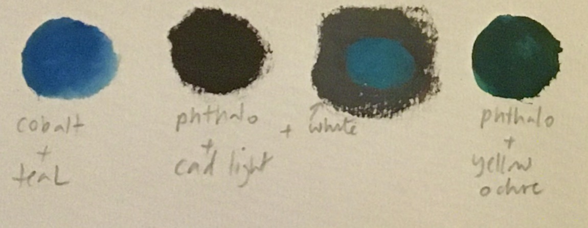
Cobalt + Teal, Phthalo Blue + Cadmium Red, PB + CR + White, PB + Yellow Ochre

Comments

Popular posts from this blog

Paint Application and Mark-Making

We've   been talking about brushwork and palette knives, and I want to talk a little about paint application and mark-making. Paint can be applied with so many different tools. We all started out with finger painting, and brushes seem to be an extension of our fingers, but you can put paint onto a ground with a palette knife, old credit card, sponge, roller, etc. And besides the tools you use, you have options with the techniques. I took the following list of paint application techniques from a  Craftsy  Post: 1. Dry brushing: This is where you scrub layers of colors on using small amounts of paint. 2. Washing: This is when you apply a thin layer of diluted paint over the colors already applied. The thin veil of color allows the colors underneath to still shine through. 3. Dabbing: For adding texture. Apply thick paint with a stiff bristle brush or a sponge, with a pouncing motion or with quick dabs. Dabbing can be done in multiple layers to build depth. 4. Detailing: Thi...

Composition and Principles of Design

Composition is the way you arrange the parts of your picture on the page. Artists work to arrange the parts (lines, shapes, colors, and textures) on the page so that they will grab the viewer’s attention and keep the eye moving all around.  When you begin to work with composition you step away from rendering exactly what you see, and begin to make artistic decisions about what you want to express, and how. The process of composing the picture is called design , a process of selection, simplification, distortion, and rearranging.  Artists use "principles of design" to make decisions about how to arrange the parts of a drawing. Some of these include: Variety:  Using different shapes, lines, colors, and textures to create interest. Harmony: Using similar shapes, lines, colors, and textures to help the design hold together.  Unity:  Organizing the parts of a design so they work together.  Simplicity: Eliminating parts in order to create better unity. Balan...

Nature Sketching

A  nature journal is a collection of drawings from observation in nature:  Get a sketch book and some drawing tools and take them with you when you go to the woods or the beach. Draw what interests you, and take notes.  Drawing in nature can help you to understand how plants and animals are put together, and also help you to really see and remember. I usually combine nature drawing with photos, so if I decide to do a larger drawing or painting in the studio I have plenty of reference material. A page in your nature sketchbook doesn’t have to be a pretty, finished drawing. It’s a practical tool and it can help you learn new things.  Add some metadata to your page, like the date, the weather;  note the size, the color, the habitat or the smell. What does it feel like? Where did you find it?  Add questions that you want to look up later. Here are different ideas and methods that you can use in your nature journal. Draw one item in natu...