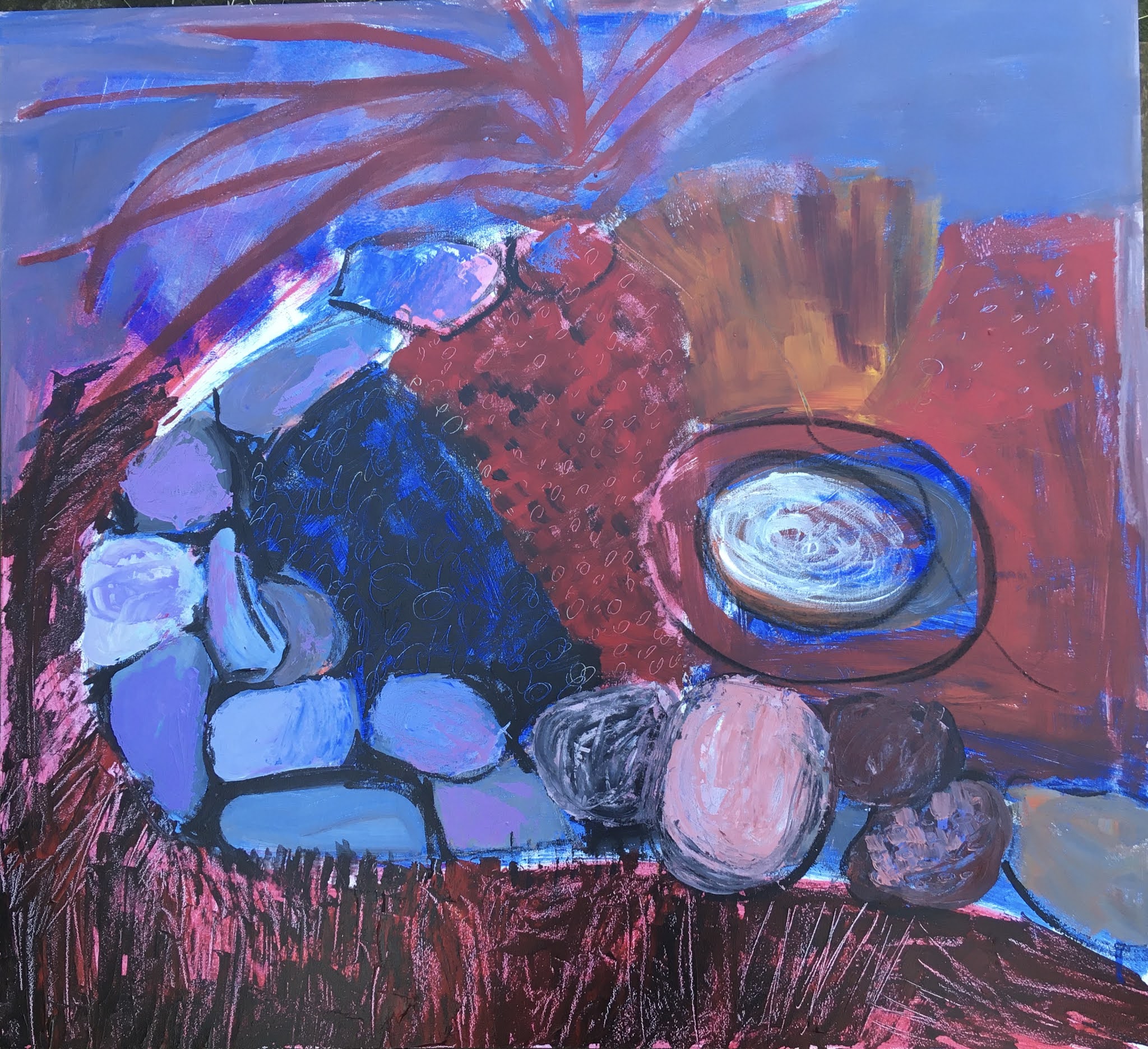
Rock Garden

Here  is my latest work, a larger version of my Rock Garden. Notice the mark-making on the bottom part that will become grass eventually, and on the central red and blue areas that will be soil and moss. (I'm using a dramatic underpainting of complimentary colors):

Day one

Day two


Week 2
Here I've added in the greens of grass and plants, and rock-like texture with my palette knife.

Week 3

And here I've lightened the whole scheme with pastel colors. The composition is beginning to feel a little static and at the same time too busy...  my next steps will be to 

  • add a thicker, darker line of shadow under the bottom rocks to ground it and frame it, 
  • Continue the darker line on the mid right upward, (then inward in a spiral?)
  • Add a suggestion of more rocks behind the irises?

Comments

Popular posts from this blog

Composition and Principles of Design

Composition is the way you arrange the parts of your picture on the page. Artists work to arrange the parts (lines, shapes, colors, and textures) on the page so that they will grab the viewer’s attention and keep the eye moving all around.  When you begin to work with composition you step away from rendering exactly what you see, and begin to make artistic decisions about what you want to express, and how. The process of composing the picture is called design , a process of selection, simplification, distortion, and rearranging.  Artists use "principles of design" to make decisions about how to arrange the parts of a drawing. Some of these include: Variety:  Using different shapes, lines, colors, and textures to create interest. Harmony: Using similar shapes, lines, colors, and textures to help the design hold together.  Unity:  Organizing the parts of a design so they work together.  Simplicity: Eliminating parts in order to create better unity. Balan...

Vibrant Loose Brushwork

I've been looking for videos to post of the kind of loose brushwork we've been talking about and this one from Peter Wood Arts is fun. He starts with a dark blue underpainting. Another way to describe it is "Optical Mixing" rather than mixing on the palette. That was invented by he Impressionist painters like Claude Monet. Optical mixing eliminates perfect coverage and smoothly-blended transitions.  Claude Monet, Impression, sunrise 1872 Jackson's Art Blog describes it: "The Impressionist painters used layers of colours, leaving gaps in the top layers to reveal the colours underneath. The technique is achieved through hatching, cross-hatching, stippling, drybrushing, and sgraffito (scratching into the paint). Mixing of brighter colours is done directly on the canvas to aid in creating the broken colour effect and only darker colours are mixed on the palette." Next week: Bring an old canvas board to play on. We will paint abstract water together, just ...

Paint Application and Mark-Making

We've   been talking about brushwork and palette knives, and I want to talk a little about paint application and mark-making. Paint can be applied with so many different tools. We all started out with finger painting, and brushes seem to be an extension of our fingers, but you can put paint onto a ground with a palette knife, old credit card, sponge, roller, etc. And besides the tools you use, you have options with the techniques. I took the following list of paint application techniques from a  Craftsy  Post: 1. Dry brushing: This is where you scrub layers of colors on using small amounts of paint. 2. Washing: This is when you apply a thin layer of diluted paint over the colors already applied. The thin veil of color allows the colors underneath to still shine through. 3. Dabbing: For adding texture. Apply thick paint with a stiff bristle brush or a sponge, with a pouncing motion or with quick dabs. Dabbing can be done in multiple layers to build depth. 4. Detailing: Thi...