We've been experimenting this year with abstraction from nature, and the color palettes of the seasons, but you can also create your own personal color palette or color scheme that mirrors your personality.
Does a limited color palette suit you, or a riot of color? Bright colors or muted? Cools or warms?What is your favorite color or combination of colors? Do you prefer harmonious (analogous) colors or contrasting (complementary) colors?
Which of the seasonal palettes did you prefer?
By choosing the colors you like when you paint you will paint in a more personal manner and express yourself more clearly. You might get a hint from your wardrobe, or your house decor, or the tubes of paint in your drawer.
Take a look at the article "How to Create a Color Palette for Your Art Practices"
Here’s a simple process any artist, professional or aspiring, can use to create color palettes.
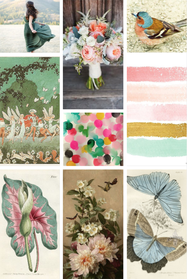
Step 2: Identify a Theme: Now, review your collection, whether it’s online or off. Are there colors that appear in more than one (or all) of them? See if you can pick out one or two colors that keep showing up for you. This is the foundation of your color theme. In the collection above, for example, the images trend toward green, sea foam, and sage hues.
Step 3: Expand Your Theme: From here, go back to your image sources and collect five to 10 more images based on the color theme you’ve discovered. Keeping with this example, you’d want to continue searching for and collecting images with sage or sea foam green in them.
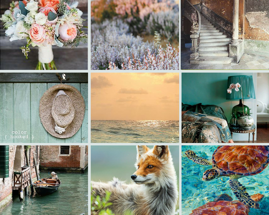
Step 4: Build a Color Palette: Next, review this new collection of images and make note of the other colors that appear with those in your original color theme. In the set of images below, for example, the peach in the flowers also shows up a bit in the brick walls of Venice. There are also copper tones in the turtle and the fox, as well as darker muted blues and purples in the stairs and water. Go through your images and pick three or four colors that complement your original color theme. This collection of four to six colors is your color palette!
Comments
Post a Comment