
Limited Color Palette

We've 
been talking about a personal palette, as in the colors that attract you, but you might also choose to use a limited palette, as in "setting yourself some parameters to simplify". 

The site Artsy.net has a post about this, which I've posted excerpts from below. 

NOTICE that the 6-color Primary Palette is the one I started you out with!

The Limited Color Palettes Artists Can Use to Excel at Painting

Painters today have more pigments to choose from than any other artists in history. They can buy traditional, historical varieties that Rembrandt would recognize, such as siennas and ochres, or 20th-century innovations like phthalocyanines and quinacridones—pigments with an intensity that would have startled even the color-loving Impressionists. Despite this abundance, many artists and art educators endorse the use of a restricted “limited” palette as a way to develop coherent, harmonious, and personal paintings.

Monochromatic palettes

Limited palettes are great learning tools. Students are often taught to paint in monochrome, using only a dark brown or black pigment, plus white. This allows them to focus on accurate shapes, degrees of light and dark—called “values” or “tones”—and paint application, without the additional complexity of color. By mastering these austere palettes, students build a strong foundation for the later introduction of color. 


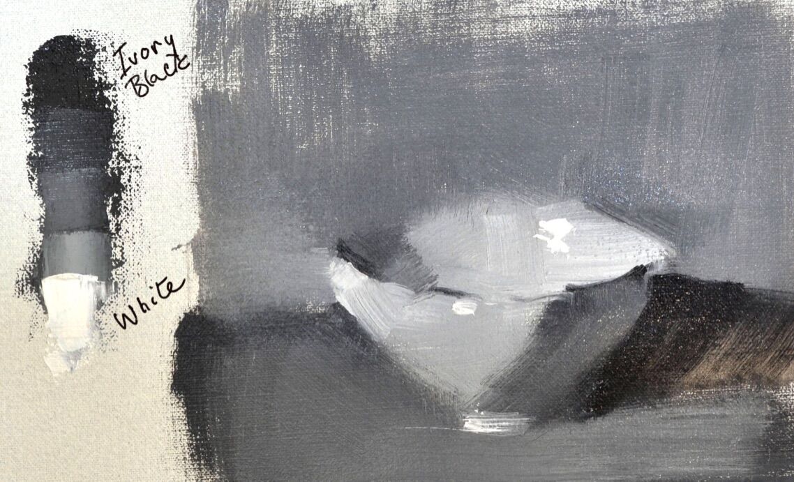
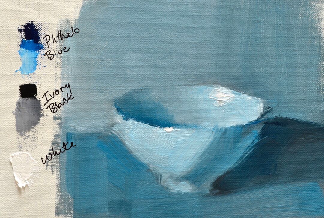
A more contemporary monochromatic approach involves using black and white, plus another color. In this example, phthalocyanine blue is introduced to produce a work of tonal accuracy that transcends the academic flavor of a strict black-and-white exercise.


Palettes with one warm and one cool pigment
To add more versatility to their palettes, painters may choose to select one warm and one cool pigment, plus white. In this example, burnt sienna and ultramarine blue are mixed to create a full tonal range, as well as temperature variations from cool to warm. Color temperature is a useful tool for creating the illusion of depth on the two-dimensional canvas.


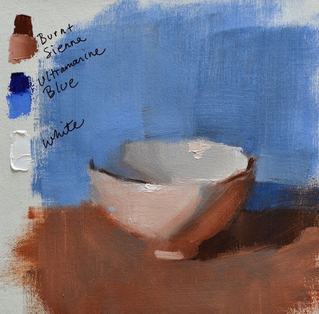
Warm colors appear to come forward in a painting, while cool colors are recessive. This effect is visible at the inner and outer parts of the bowl. Both areas are greyed because they contain all three colors of the palette, and they are exactly the same value. Yet mixing a larger amount of burnt sienna into the front of the bowl results in a warm color, while mixing more ultramarine into the inner bowl makes it cool.

Notice how the warmer mixture appears closer to the front of the picture plane, while the cooler color recedes into the middle ground. This effect, added to the use of value changes, can create works that convey both form and space.

Primary palettes
For a broad range of color, a simple palette made of saturated red, blue, and yellow pigments, plus white, is key. Whenever pigments are combined, they lose some chroma, so starting with high-chroma colors ensures that your mixtures will be intense.

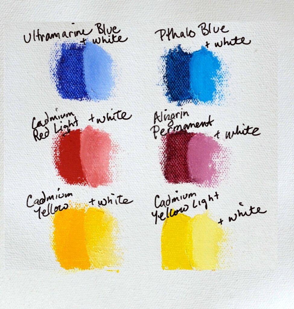
(But) Every three-color primary palette will have some weaknesses in color rendering, and artists who want to be able to achieve pure purples, oranges, and greens will have to add colors to it. One way to address this weakness is by adding a single missing pigment, such as green or orange, or by choosing to use a six-color split primary palette instead.

The six-color (primary) palette contains warm and cool versions of each of the primaries—red, blue, and yellow. A sample palette may contain cadmium yellow and cadmium yellow light; ultramarine blue and phthalocyanine blue; and cadmium red light and alizarin permanent.


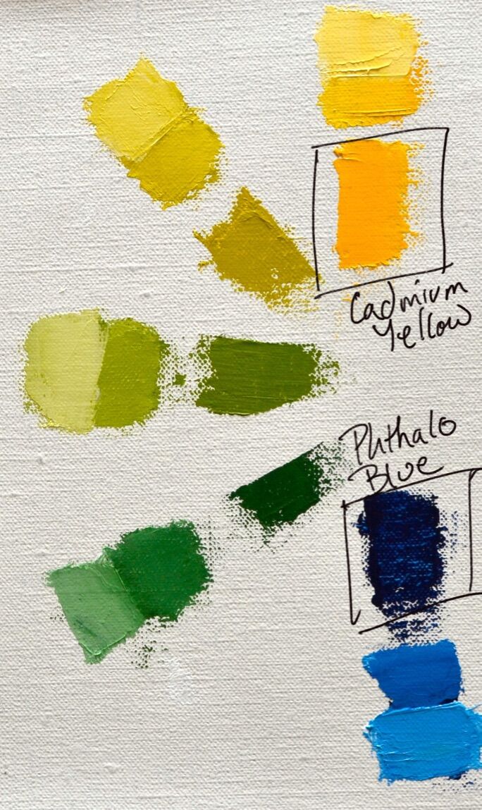
Charting the greens alone shows the broad range of hues—from warm olive to cool lime—that can be achieved with two yellows and two blues. No single green you purchase can achieve such variety.


A painter’s palette is, ultimately, an expression of how they see the world and the colors that they love. By exploring a variety of limited palettes from earthy to intense, painters can discover the combination of colors that best helps them convey their world view.

Comments

Popular posts from this blog

Paint Application and Mark-Making

We've   been talking about brushwork and palette knives, and I want to talk a little about paint application and mark-making. Paint can be applied with so many different tools. We all started out with finger painting, and brushes seem to be an extension of our fingers, but you can put paint onto a ground with a palette knife, old credit card, sponge, roller, etc. And besides the tools you use, you have options with the techniques. I took the following list of paint application techniques from a  Craftsy  Post: 1. Dry brushing: This is where you scrub layers of colors on using small amounts of paint. 2. Washing: This is when you apply a thin layer of diluted paint over the colors already applied. The thin veil of color allows the colors underneath to still shine through. 3. Dabbing: For adding texture. Apply thick paint with a stiff bristle brush or a sponge, with a pouncing motion or with quick dabs. Dabbing can be done in multiple layers to build depth. 4. Detailing: Thi...

January insights

Our  assignments last week led us on a rich dialogue! We looked at paintings that inspired you in the New Year.  I was impressed with your choices, and inspired in turn.  After our discussion I set some homework for you: Tami:  1. Work on brush handling. Check out the step by step painting web site for some exercises to try. (She also has a buying guide if you ant to get any new brushes.) 2. Your goal is to finish some of your paintings, so please choose the one you want to work on and be prepared to work on it! Becky:   1. Explore Red.  One of your choices for inspiration was this one, below. Your assignment is to buy some new tubes of red and paint splotches of many different mixtures of red, taking some notes,  and make a list or a chart of colors you like best so you can begin to incorporate them into your work. 2. Bring a photo of a landscape that means something to you, and be prepared to riff on it in an abstract way. Abstract Landsca...

Nature Sketching

A  nature journal is a collection of drawings from observation in nature:  Get a sketch book and some drawing tools and take them with you when you go to the woods or the beach. Draw what interests you, and take notes.  Drawing in nature can help you to understand how plants and animals are put together, and also help you to really see and remember. I usually combine nature drawing with photos, so if I decide to do a larger drawing or painting in the studio I have plenty of reference material. A page in your nature sketchbook doesn’t have to be a pretty, finished drawing. It’s a practical tool and it can help you learn new things.  Add some metadata to your page, like the date, the weather;  note the size, the color, the habitat or the smell. What does it feel like? Where did you find it?  Add questions that you want to look up later. Here are different ideas and methods that you can use in your nature journal. Draw one item in natu...